Performing Feminism in Book Covers: A Multimodal Analysis of Reprint and Retranslation Cases in South Korea
Abstract
The feminist movement, which includes certain radical elements, is gaining traction in South Korea. In South Korea’s publishing industry, feminism has demonstrated this evolution, with more visible and bold expressions. Against this background, this study analyzes how the book covers of translated feminist classics have evolved over time and what kinds of messages are transmitted to female readers with increasing exposure to feminism. The reprints and retranslations in the analysis are reflected in the book covers as a space for ideological appeal, sending specific messages derived from the multimodal analysis of the book covers. This study demonstrates how a multimodal analysis of the metafunctions of semiotic resources on book covers can be applied to derive messages for the target readership. Finally, a diachronic comparison of the book covers substantiates the claim that the book-cover design of translated works is closely associated with the social setting of the target culture and its ideological stance.
Keywords:
Feminist book translation, book-cover design, multimodality, visual grammar, systemic functional grammarIntroduction
The feminist movement, which includes certain radical elements, is gaining traction in South Korea. This surge, particularly since the mid-2010s in conservative Korean society, was catalyzed by two major events: the 2016 Gangnam murder case and the #MeToo movement (Lee, 2020, p. 176). The Gangnam murder case was a femicide that occurred in a public restroom in the Gangnam District of Seoul in 2016. For the #MeToo campaign, one of the most pivotal moments emerged in 2018 when a former aide to a South Korean presidential contender accused her boss of raping her on multiple occasions. Despite the initial court support for the defendant, a public outcry led the Seoul High Court to sentence the politician to three and a half years. This case is South Korea’s most prominent #MeToo conviction of a powerful individual. Additionally, from 2015 to 2016, there were confrontations between feminists and anti-feminists, including the Megalia1 issue, in pop culture critic Kim Tae-hoon’s column.2 As feminist issues have gained recognition as critical social issues, an increasing number of women have openly identified themselves as feminists, leading to the hashtag #iamafeminist movement on Twitter, which aimed at collectively reclaiming the feminist identity. This increase in awareness has boosted sales in South Korea’s publishing industry, especially for feminist books (Jeong, 2017, pp. 171–173). In the first half of 2017, six out of ten feminist books sold in South Korea were translations of feminist works (Lee & Sun, 2017, p. 110), and reprinting and retranslating classic feminist books increased. In particular, book purchases by women in their 20s saw a dramatic increase in 2016, influenced by the rising feminist movement and changes in book-cover designs (Kwon, 2017).3
Against this background, this study investigates how feminist ideology manifests and is reinforced in the book covers of reprinted and retranslated feminist classics.4 It does so by contrasting editions published before and after feminism emerged as a prominent social issue in South Korea. The areas that demand particular attention are as follows: how are the book covers transformed over time to manifest and reinforce feminist ideology; what kinds of feminist messages are delivered in the newly revised book covers; and how are the messages transmitted through semiotic resources other than words?
Literature Review
Book Covers and Gender
Genette (1997) refers to book covers and other paratextual materials as seuils (thresholds) where readers decide to either step inside or turn back (p. 2). As information on book covers is essential for readers to judge content, book-cover design has ideological significance in guiding and even governing readers’ reading experiences (Pingping, 2013, p. 37).
Therefore, analyzing book covers is useful for revealing the sociocultural contexts in which reprints and retranslations are produced, received, and consumed. The transformation symbolizes an intervention in ideology and indicates that literary systems are related to social, religious, or other systems in the target culture (Lambert, 1985, pp. 38–39). One critical ideological issue concerning paratextual analysis is gender/feminism (Batchelor, 2018, p. 36).
Lee (2021) studied paratexts in South Korean feminist book translations, focusing on titles, cover images, and translators’ prefaces. He identified three key characteristics of book covers: the predominant use of friendly, pink illustrations, and positive imagery of feminism. He concluded that those involved in transforming book covers have contributed to stressing the feminist theme and strengthening readers’ attachment to feminism by localizing book titles and cover images. However, the description of the cover images and colors of feminist book translations does not fully explain why such characteristics in feminist book translations are meaningful in Korean society, although he claims that such characteristics have constructive effects on South Korea’s transition to a gender-conscious society. The implications of the book-cover analysis would be more compelling if the characteristics were compared to those in the translations published at a time when patriarchal ideology prevailed in South Korea.
Therefore, this study examines the evolution of cover images in translated feminist classics by comparing older, subdued messages with stronger, more recent ones. It focuses on how these covers have changed over time, and the messages they convey to an increasingly feminist-aware female readership.
Frameworks of Multimodal Analysis on Functions of Semiotic Resources
Multimodality refers to the combination of different forms of communication– language, image, gesture, gaze, posture, etc.–and the relationships among these resources (Jewitt, 2017, p. 15). Multimodal analysis can be approached using three methodologies: a social semiotic approach associated with the work of Kress and van Leeuwen (2006); Halliday’s (1978) systemic functional grammar approach to discourse analysis at the microtextual level (Painter, Martin, & Unsworth, 2013); and a multimodal interactional analysis that combines interactional sociolinguistics, intercultural communication, and multimodal semiotics (Scollon & Scollon, 2003). This study draws on Halliday’s (1978) metafunctional theory, which provides a framework for the organization of meaning according to three communicative functions: ideational, interpersonal, and textual.
The ideational function can be examined by analyzing the different ways in which objects and their relations to other objects are represented. Images capture moments; therefore, we can only speculate about what is actually happening, and this speculation is based on “indexical signs” (Ledin & Machin, 2020, p. 56). For instance, an image of someone repairing a bike represents the material process that occurs at that moment.
The interpersonal function of semiotic resources can be analyzed by paying special attention to gaze, color, and line. They convey important potential meanings and carry specific communicative meanings in each context. Kress and van Leeuwen (2006) offer a framework to describe the meaning potentials of gaze, color, and line, proposing “a grammar of visual design” to explain the meanings they represent. Specifically, when the individuals depicted on the book-cover gaze directly at the viewer’s eyes, a connection is established, even on an imaginary level. The creator of a depiction uses an image to influence the viewer. As a result, an image featuring individuals gazing directly at the viewer is referred to as an image of “demand” (pp. 117–118).
Additionally, colors and lines in images can establish emotional tones and evoke responses from viewers. Kress and van Leeuwen (2006) elaborated the distinctive features of color—value, saturation, purity, modulation, differentiation—and the meaning potential that the features deliver to viewers. For example, saturated colors are associated with emotional intensity and excitement.
Lines also have significant meaning. Chen (2018) stated that different qualities of lines, such as the ways in which lines are drawn, produce different expressive meanings. For instance, thin curved lines evoke a sense of graceful elegance, while thick zigzag lines represent aggressiveness or sharpness (p. 217).
Textual functions can be realized through the visual composition of semiotic resources. The various places of semiotic resources carry specific informational values: left and right, top and bottom, center and margin (Kress & van Leeuwen, 2006, p. 177). Specifically, the semiotic resources placed on the left are presented as “given,” which is something familiar and already known by readers; the other resources placed on the right are presented as “new,” which is something unfamiliar and not yet agreed upon by readers, requiring special attention.
In addition, different cultures place different emphases on composition. For instance, Asian observers place more importance on central composition, tracing back to Confucianist emphasis on hierarchy, harmony, and continuity. Meanwhile, Anglo-Western tabloid newspapers tend to adhere to a left-right structure in the layout (Kress & van Leeuwen, 2006, pp. 194–195).
Choi (2011) analyzed Halliday’s metafunctions of communication and their corresponding visual cues found in book covers of the 20 most popular Korean translations as well as their original versions. This study provides a summary of the grammar of Systemic Functional Linguistics and the grammar of visual images that actualizes these metafunctions. Based on previous research, this study analyzes the ideational, interpersonal, and textual elements involved in the interpretation of messages conveyed by book covers, albeit with a slightly greater emphasis on the interpersonal and textual components.
Methodology
Reprints and retranslations of feminist classics were selected for analysis to understand how feminism became prominent in editions published during periods of heightened interest in feminist ideology.
First, books known as feminist classics were selected to juxtapose the diachronic differences in book covers of translations of feminist classics. It is indisputable that the target readership of feminist canon translations is those who are receptive to feminism and willing to consider the feminist ideology manifested in the book cover. As a result, translations of feminist classics have revealed an unreserved feminist ideology.
Second, book covers were chosen for analysis because they require less editorial authority for publishers to reveal their ideological stance than do main text translations. With its conservative and hierarchical publishing culture, South Korea rarely permits translators to embark on interventionist roles as feminist translators who can manipulate main texts (Lee & Sun, 2017).
Therefore, this study diachronically compares the book covers of feminist translations from periods when feminism was less contentious to more recent radicalized times.
Specifically, it examines how the current editions’ multimodal cover aspects bolster feminist ideology and the messages it conveys.
Data
Two types of data were selected for the diachronic analysis of the transformation of book-cover design and reinforcement of feminist ideology: reprints and retranslations of feminist classics.5 The reasons for selecting these books are as follows: first, they are categorized as essential feminist reading by public libraries, such as the New York Public Library6 or the Chicago Public Library.7 Second, they significantly influenced the development of feminism in South Korea (Baek, 2017; Kim, 2018; Lim, 2012). Third, two translation editions are available: one published before 2016 and the other after. This is significant because 2016 marked a critical point in the popularization of feminist books in South Korea’s publishing industry (Jeong, 2017).8
For the reprints, the first and second editions of Egalia’s Daughters and A Room of One’s Own were selected. As they were reprints, no differences were detected between the first and second editions in terms of rendering the main texts. However, the second editions incorporated feminist ideology into book covers, making it the only area of meaningful change.
Five feminist classics were selected for retranslation: The Subjection of Women, The Feminine Mystique, The Dialectic of Sex, The Anti-social Family, and Woman: An Intimate Geography. The first translations were published before 2016, whereas the retranslations were published after 2016, as shown in Table 2.
Feminist Messages Reinforced in Book Covers
As feminism gained traction in South Korea, the second edition covers of feminist translations showcased stronger feminist messages. These messages can be discerned by analyzing the metafunctions of semiotic resources in book covers. The specific conclusions are as follows.
Message 1: Act With Confidence.
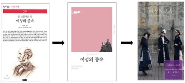
The retranslations of The Subjection of Women deliver the message that women should stand tall and conduct themselves confidently. The first, the second, and third retranslations will be published in 2006, 2018, and 2022, respectively. As shown in Figure 1, the first edition features a portrait of John Stuart Mill that does not clearly convey the theme of gender equality. In the 2018 retranslation, the book-cover image was changed to male or female. Although the background color has changed to pink, a redefined symbol of subversion and women’s empowerment (Elan, 2014), the figures are still placed on the margin, not receiving full attention. However, the 2022 edition strongly communicates women’s empowerment through ideational, interpersonal, and textual meanings in the book cover.
First, the three women on the book cover their gaze at viewers. At the interpersonal level of meaning, this indicates they are demanding that “the viewers enter into some kind of imaginary relationship” (Kress & van Leeuwen, 2006, p. 118) with them. The type of relationship they want to establish is signified by their gestures of placing their hands on their waists, which emits a sense of self-confidence. Their confident gaze and gestures suggest that they are asking the viewers to enter into a relationship of solidarity, encouraging them to show more confidence.
Second, vertical lines were often associated with standing and conveying a sense of status. “The slightly vertical lines could mean strength and solidarity” (Ledin & Machin, 2020, p.112). As the book cover of the 2022 edition shows, the three women in the full shot form vertical lines that emit feelings of strength and solidarity.
Last, the blurb on the bottom right corner reads, “이제와 돌이켜 보면 여성들이 어떻게 여기까지 올 수 있었는지 (Looking back now, how could it have been possible for women to arrive here?).” This phrase implies that women have made significant progress in breaking free from past oppression and stifling societal norms.
In summary, the composition of the pictorial and written elements conveys a message of pride and empowerment for women, encouraging them to embrace their achievements and act confidently.
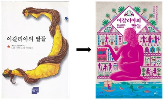
Another example that delivers a similar message is the second edition of Egalia’s Daughters Korean translation. The first edition was published in 1996, and the second edition was published in 2016 by the same translators and publisher. A comparison of the two editions reveals that feminist ideology was further illuminated in the second edition by encouraging women to take a central position. As seen in Figure 2, the book cover of the first edition displays an abstract image of a man and a woman trying to choke a man with her long hair that is an essential symbol of femininity. Such an image can provoke male backlash, aggravating the gender conflict that has erupted among young South Koreans in their 20s. Therefore, the second edition removed the image and placed a pregnant woman in the center.
In East Asia’s Confucian culture with clear hierarchy, centering is a fundamental organizational principle in visual semiotics (Kress & Leeuwen, 2006, p. 195). Something that is presented at the center represents the nucleus of the information to which all the other elements are subservient and exerts “power” (Arnheim, 1982). In addition, in a male-dominated society such as South Korea, pregnancy should be avoided or concealed by working women.9 However, the book cover of the second edition gives power to the pregnant woman by placing her at the center and delineating her with vivid colors.
Color conveys interpersonal meaning. “It can be and is used to do things to or for each other to impress or intimidate through power-dressing” (Kress & van Leeuwen, 2006, p. 229). Colors have associated values. For instance, the color blue is often associated with purity, as water is also associated with purity (Ledin & Machin, 2020, p. 98). Warm colors such as pink or red can be associated with dynamic ideologies such as feminism. (Lee, 2021, p. 141). In South Korea, many feminist books translated and published after 2016 have used pink as the predominant color on their covers. As of January 2017, six of the top 10 bestsellers in the field of feminism and gender featured pink as the dominant color or incorporated pink elements into their cover designs (Lee, 2017). According to color psychology (Olesen, 2021), magenta, a more saturated and intense version of pink, is associated with passion and power, and there is a great deal of intensity behind this striking color. This bolsters people’s confidence and represents a free spirit that does not conform to society. With a pregnant woman in magenta at the center of the cover, the second edition provokes readers, especially women, to be more passionate, confident, and liberal in expressing their individual views.10
Given the composition and color of the image, the second edition of Egalia’s Daughters’ translation conveys a message encouraging women to conduct themselves confidently.
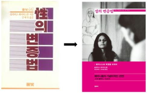
Another case denoting the same message is the retranslation of The Dialectic of Sex in Korean. As seen in Figure 3, the book cover of the first translation gives no hints about the theme of the book even though the original presents a radical feminist position.
The first Korean translation published in 1983 merely provides the title and names of the author, translator, and publisher on the cover. Even the title, “변증법 (The Dialectic)” attracts more attention as it is placed at the center. However, the book cover of the retranslation published in 2016 shows representational and interactive relations between the images and viewers. The woman placed in the middle faces the viewers frontally, with her chin slightly lifted. In addition, she has a sharper focus than the other characters, staring at her in the foreground. The woman at the center is contrasted with the woman in the drawing in the background. The woman in the drawing sits modestly with her eyes closed and her fingers locked together, which is far from emitting confidence. However, the woman in the middle looks defiant and daring in her nakedness, paying no attention to the gaze that towers over her from a high angle. This indicates that the woman has confidence in herself regardless.
On top of that, the blurb with the magenta background says, “페미니스트 혁명을 위하여 (For feminist revolution)” and “페미니즘의 기념비적인 선언 (A landmark manifesto of feminism),” encouraging female readers into taking radical actions. In effect, the book cover of the Korean retranslation is almost the same as that of the original English book published in 2015, except that the color of the title and bottom part is white in the original and magenta in the retranslation. Also, the phrase “a landmark manifesto of feminism” is emphasized more in the retranslation than in the original by using bigger fonts and black color. The entire composition of the pictorial and written elements transmits the message that women should act confidently.
The second message, manifested in the transformed book cover of the second edition, was for women to be more active.
Message 2: Be More Active.
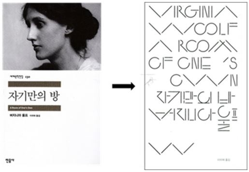
The first Korean translation of A Room of One’s Own was published in 2006 and the second edition was published in 2016 by the same translators and publishers. As Figure 4 shows, the visual illustration on the front cover of the second edition communicates a more pronounced and dynamic message to readers, especially young female readers, urging them to lean in and become more proactive in their engagement with feminist discourse.
This type of text-only cover is suitable for books with strongly evocative titles or bestsellers, in which the name of the author and the title of the book create a certain logotype (Sonzogni, 2011, p. 25). In this case, the name of the author and the title were composed of lines that alluded to specific meanings. Tilting lines, for instance, create oblique lines and a sense of vectoriality. The vectors formed by oblique lines exude dynamic action (Kress & van Leeuwen, 2006, pp. 57–59). A sequence of joining diagonal lines (\/\/ or /\/\), in particular, tends to deliver a sensation of lifting, making people and objects appear lighter and more youthful.11 Chen (2018, p. 217) claims that zigzag lines represent aggressiveness or sharpness (p. 217).
Although the portrait of Virginia Woolf on the front cover of the first edition adhered to the conventional approach to the representative picture common in the South Korean publishing sphere, the second edition boldly dispensed with the conventional image of Virginia Woolf and employed 11 pairs of joined diagonal lines as its main image on the front cover, essentially delivering a message of dynamic movement.
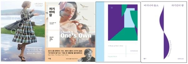
The retranslation of A Room of One’s Own has four editions published in 2002, 2003, 2007, and 2008 (Figure 5). The covers contain images that highlight chairs and space, rendering women who are supposed to take up the space invisible (the first and second covers from the left); therefore, the purpose of the chairs and space remains ambiguous. In the third book cover from the left, a woman writes something in a room with uncertain ownership—her own room or kitchen, which belongs to the entire family. In the fourth cover from the left, a young woman passively fiddles around, doing nothing in the room. These images of the book-cover retranslations published before 2010 emanate static feelings and passivity rather than encouraging women to initiate active roles or take dynamic actions.
However, the book covers retranslations published after 2010 (Figure 6) exhibit more dynamism and activeness, with images of women in action. Women dancing with joy from independence (the first and second covers from the left) induce female readers to take agency and ownership over their actions. Such an encouraging reading of the image can be derived from abstract images that have tilting and obliqueness (the third from the left) or vertical elongation of geometrical shapes (the fourth from the left). Vertical elongation creates a bias toward hierarchy (Kress & van Leeuwen, 2006, p. 57), so the vectoriality contained in the images delivers the sensation of lifting, taking action, or even subversion.
Next, the third message manifested in the transformed book covers of the retranslated version is that women should not hesitate to overthrow the traditional values (or virtues) that have fettered them.
Message 3: Do Not Hesitate to Overthrow Traditional Values.
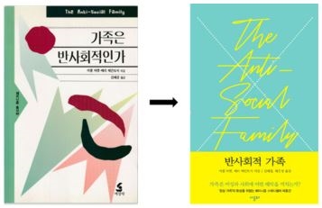
The first Korean translation of The Anti-social Family was published in 1994, and the retranslated version was published in 2019. When the first translation was published in 1994, the feminist movement in Korean society remained mostly obscure. Hence, the translator (or publisher) hesitated to keep the original title intact in the translation, since the literal rendition affirms that the family is anti-social. In Confucian Korean society, where filial piety and family harmony were valued the most, it would not have been easy for the translator (or the publisher) at that time to declare that the family was anti-social. As a result, the declarative title, The Anti-social Family, is changed into a question, 가족은 반사회적인가 (Is the Family Anti-social). However, in the retranslation published in 2019, the traditional value was overturned by literally rendering the original title into 반사회적 가족 (The Anti-social Family). In addition, the pictorial elements of the book cover of the retranslation deliver a message that is different from that of the first translation, as shown in Figure 7.
In the first translation, the abstract image on the right side of the cover attracts readers’ attention with its salience. Salience is realized through facts such as placement in the foreground or background, relative size, and contrasts in color (Kress & van Leeuwen, 2006, p. 177). Because pictorial elements are placed in the foreground in highly saturated colors, they pull stronger emphasis than other elements and become more important information items. Besides, the elements placed on the left side is presented as “given,” as information that is already familiar to the reader, whereas those positioned on the right are presented as “new,” as information not yet known to the reader, and hence deserving readers’ special attention (Kress & van Leeuwen, 2006, p. 57). Therefore, the abstract image on the right is the most eye-catching element of the cover. The message that can be derived from the image does not challenge traditional family oriented cultural values but promotes harmony in a family where two different participants mingle. Consequently, the image only goes so far as to question traditional values rather than deny them.
On the other hand, the retranslated version explicitly denies the tradition of holding a family sacred by placing a large cross mark in the background. In addition, the typeface of the title has many oblique lines that appear to attack traditional ideology. With the literal rendition of the original title and the aggressive image that strongly denies traditional ideology, the retranslation delivers a strong message of overthrowing traditional values.
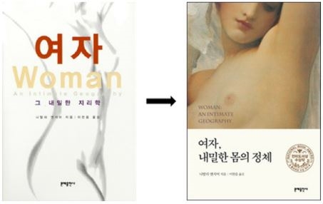
Here is another case of overthrowing traditional virtues on the book cover of a recently published translation of a feminist classic. Under Confucianism, sexuality is regarded as taboo, and public discussion about sexuality or women’s bodies is forbidden (Gao et al., 2012, p. 2); therefore, the traditional virtue imposed on women is to be submissive and less sexually aggressive than men (Go et al., 2002). Although the content of Women: An Intimate Geography (1999) contains an explicit guide to the female body, from organs to orgasms and hormones to hysterectomies, the book cover of the first translation published in 2003 draws the attention of readers to “여자 (Woman)” rather than “body” by placing the word, “여자 (Woman)” in the foreground and highlighting it with bright red. As shown in Figure 8, a rough drawing of a female body is placed in the background, thereby receiving little attention. Besides, the literal rendering of the title into Korean, “그 내밀한 지리학 (the intimate geography),” does not clearly denote the theme of this book, which is to explore a female body and her biological desire.
However, the retranslation published in 2016 displayed a woman’s body without any reservations, focusing more on the woman’s breasts, a symbol of women. In addition, the Korean title is changed to “여자, 내밀한 몸의 정체 (Woman, the Identity of Intimate Body),” which explicitly mentions “body” in the title. Consequently, the image and title overthrow the traditional virtue of not publicly showing or talking about the female body. Therefore, the message that the book cover of the retranslation intends to deliver is that women should not shy away from discussing sexuality and overthrow the traditionally imposed virtue of concealing their bodies and desires.
The fourth message that can be derived from the transformed book cover of the retranslation is a request for women to wake up from the feminine illusion.
Message 4: Wake Up from the Feminine Illusion.
The first Korean translation of The Feminine Mystique was published in 1996, when Korean women were not permitted to explore their identities outside their assigned domestic spheres. The retranslated version was translated in 2018, when an increasing number of young women started experimenting with liberating themselves from the shackles of inequality, marriage, and patriarchy in Korean society. In the first translation, the original title, The Feminine Mystique, is translated into “여성의 신비 (The Wonder about Women).” However, the Korean title in the first translation does not reveal the writer’s intention, who challenged the widely shared belief that fulfillment for women could be found in marriage and housewifery. The translated title has the potential to mislead readers into a positive perception of paradigmatic femininity, even though the original intention of the book is the opposite, namely encouraging women to wake up from the feminine illusion. As a result, the title is changed to “여성성의 신화 (The Myth of Femininity)” in the retranslation to let female readers know that the traditional perception of femininity is false.
The pictorial elements in the book covers, as Figure 9 shows, have also been transformed in the retranslation to awaken women from the undue restraints imposed on them. The book cover of the first translation does not contain any graphic elements that attract the readers’ attention. Only frame lines exist along the margin and they do not demarcate any elements from the others. The cover displays the original and translated titles and names of the author, translator, and publisher as a single unit of information.
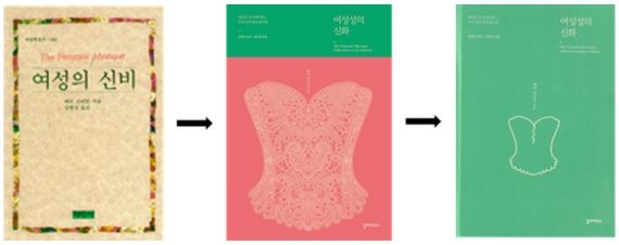
Book covers of the first translation and retranslation of The Feminine Mystique with/without a wrap-around band
However, the book cover of the retranslation has a strong demarcation line created by the different colors of the band that wraps around the book. The background color of the cover is green, but the pink wrap-around band with the image of a glamorous and sparkling corset attracts the reader’s eyes. The corset is a symbol of patriarchal oppression. It is related to the subject of this book, which argues that the myth that the ultimate role for women is to be a homemaker and mother has acted as a “corset” that has restricted her opportunities and stifled her potential.
The book cover with the wrap-around band illustrates that feminine restrictions may seem glamorous and attractive at first (see the middle picture in Figure 9). However, once women wake up from this false illusion, they realize that the undergarment that fortifies their female identity is just a dowdy restraining device. Once the band that wraps around the book is removed, the image of a crude corset is shown, which is far from glamourous (see the picture on the far right of the three pictures in Figure 9).
Besides, a blurb on the left top corner says, “새로운 길 위에 있는 우리 모두에게 용기를 (Give courage to all of us on a new path).” This short blurb encourages female readers to have the courage to break away from the restraints imposed on them under the name of “femininity,” and it sends the message to female readers that they are not alone on this road. The blurb strengthens the interpersonal function of the book cover by using “us” rather than “you.” Such a feminist narrator on a book cover can strengthen readers’ attachment to feminism (Lee, 2021, p. 95).
Discussion and Conclusion
The aforementioned reprints and retranslations have all used book covers as a space and medium for their ideological appeal, urging readers to be more engaged in riding the waves of feminism in South Korean society. The messages derived from the transformed book covers in recently published editions are first, “act with confidence,” second, “be more active,” third, “do not hesitate to overthrow the traditional values,” and fourth, “wake up from the feminine illusion.” These messages were interpreted based on a multimodal analysis of titles, typefaces, color, and the composition of pictorial elements on book covers.
It is important to acknowledge that the messages from the multimodal analysis of book covers in this study can be viewed as subjective and intuitive assessments of intersemiotic translations. Nonetheless, House (1997) addresses such critiques, contending that even if quality analysis has an interpretive hermeneutic component, “Translation is a complex hermeneutic process and this is an important point” (House, 1997, p. 103). Furthermore, given that book-cover design inevitably involves subjective choices, it is both expected and necessary for content and meaning to be related to a certain degree (Sonzogni, 2011, p. 26). Hence, this diachronic comparison of book-cover designs suggests crucial implications.
First, the book covers recently published translations show how feminism can be performed and manifested in book covers. They use the color and composition of pictorial elements to encourage women to be more confident and active in searching for and revealing their identities. Blurbs on book covers can also be used to build solidarity with female readers by strengthening the interpersonal functions of the messages.
Second, this study demonstrates how multimodal analysis of the interpersonal and textual functions of semiotic resources on book covers can be applied to convey and shape messages for the target readership. The vague impressions and feelings that readers instinctively have from the book cover can be explained more systematically by analyzing the relationships between pictorial elements, such as lines, color, and composition, and verbal elements, such as titles and blurbs.
Third, the diachronic comparison of the book covers substantiates the idea that the book-cover design of translations is closely associated with the social setting of the target culture. Previously published translations reflect the past social atmosphere in which feminism did not gain enough power to challenge the dominance of the patriarchy by weakening the correlation between the content and book covers of feminist classics. In contrast, recently published translations reflect the rise of feminism in South Korea by strengthening this correlation and providing messages that empower female readers to be proactive and expressive.
Book-cover analysis has emerged as a critical research field in translational studies. Multimodal analysis of book covers can be a valuable approach for eliciting and deciphering messages connoted in design. This study provides evidence that feminist ideology can be transmitted through nonverbal means, such as semiotic resources in book covers. While this study presents only seven case studies, the analytical approach and outcomes can serve as a foundation for further systematic research on how book covers can deliver feminist messages.
References
- Arnheim, R. (1982). The power of the centre. Berkeley and Los Angeles: University of California Press.
-
Batchelor, K. (2018). Translation and paratexts. London: Routledge
[https://doi.org/10.4324/9781351110112]

- Baek, S. G. (2017, July). ‘Egalia,’ the world where men and women changed … Why is it popular in South Korea? Chosun Ilbo. Retrieved March 20, 2023, from https://www.chosun.com/site/data/html_dir/2019/06/07/2019060700183.html?utm_source=naver&utm_medium=original&utm_campaign=news, (In Korean)
-
Chen, X. (2018). Representing cultures through language and image: A multimodal approach to translations of the Chinese classic Mulan. Perspectives, 26(2), 214–231.
[https://doi.org/10.1080/0907676X.2017.1365911]

- Choi, H. K. (2011). A semiotic analysis of visual shifts in translated book covers in Korea. Interpreting and Translation Studies, 15, 441–464. (In Korean)
- Elan, P. (2014, September). Think pink: how the colour is being reclaimed. The Guardian, Retrieved May 10, 2022, from https://www.theguardian.com/lifeandstyle/2014/sep/10/think-pink-how-the-colour-is-being-reclaimed
-
Gao, E., Zuo, X., Wanga, L., Lou, C., Cheng, Y., & Zabin. L. S. (2012). How does traditional Confucian culture influence adolescents’ sexual behaviour in three Asian cities? Journal of Adolescent Health, 50(30), S12–S17.
[https://doi.org/10.1016/j.jadohealth.2011.12.002]

- Genette, G. (1997). Paratexts: Thresholds of interpretation. Translated by Jane E. Lewin. Cambridge: Cambridge University Press.
-
Go, V. F. L., Quan, V. M., Chung, A., Zenilman, J., Hanh, V. T. M., & Celentano, D. (2002). Gender gaps, gender traps: Sexual identity and vulnerability to sexually transmitted diseases among women in Vietnam. Social Science & Medicine, 55(3), 467–481.
[https://doi.org/10.1016/S0277-9536(01)00181-2]

- Halliday, M. A. K. (1978). Language as social semiotic: The social interpretation of language and meaning. London: Arnold.
- House, J. (1997). Translation quality assessment: A model revisited. Tübingen: Narr.
-
Jeong, G. E. (2017). The aspect and meaning of the feminist publications and reading in the 2015∼2016. SAI, 22, 167–198. (In Korean)
[https://doi.org/10.30760/inakos.2017..22.005]

- Jewitt, C. (2017). An introduction to multimodality. In C. Jewitt (Ed.), The Routledge handbook of multimodal analysis (2nd ed.) (pp. 15–30). Oxon and New York: Routledge.
- Kang, H. K. (2018, June). Feminists vs. male supremacists. The Korea Times. Retrieved May 20, 2022, from https://www.koreatimes.co.kr/www/nation/2018/06/251_250384.html
- Kamiya, T. (2022, February). South Korea’s birthrate drops to new low amid economic anxiety. The Asahi Shimbun. Retrieved May 20, 2022, from https://www.asahi.com/ajw/articles/14556684
- Kim, J. H. (2018). Pull the trigger for feminism: Betty Friedan’s The Feminine Mystique and its social history. Seoul: Green History. (In Korean)
-
Koskinen, K., & Paloposki, O. (2010). Retranslation. In Y. Gambier & L. van Doorslaer (Eds.), Handbook of Translation Studies (pp. 294–298). Amsterdam: John Benjamins.
[https://doi.org/10.1075/hts.1.ret1]

-
Kress, G., & van Leeuwen, T. (2006). Reading images: The grammar of visual design (2nd ed.). London: Routledge.
[https://doi.org/10.4324/9780203619728]

- Kwon, E. J. (2017, March). What prompted women in their 20s to start buying books? Hankyoreh. Retrieved March 20, 2023, from https://www.hani.co.kr/arti/society/women/787042.html, (In Korean)
- Lambert, J. (1985). On describing translations. In D. Delabastita, L. D’hulst & R. Meylaerts (Eds.), Functional approaches to culture and translation: Selected papers by José Lambert (pp. 37–47). Amsterdam: John Benjamins.
-
Ledin, P., & Machin D. (2020). Introduction to multimodal analysis (2nd ed.). London: Bloomsbury Publishing.
[https://doi.org/10.5040/9781350069176]

- Lee, S. A. (2017, January). Why are feminist books ‘pink, pink.’ Women News. Retrieved March 20, 2023, from http://www.womennews.co.kr/news/articleView.html?idxno=110975, (In Korean)
-
Lee, S. B. (2020). Reception and revision of women-related translation paratexts: South Korean cases. The Translator, 26(2), 176–189.
[https://doi.org/10.1080/13556509.2020.1783881]

-
Lee, S. B. (2021). Translators, translations, and paratexts in South Korea’s gender conflicts. Perspectives, 29(1), 84–99.
[https://doi.org/10.1080/0907676X.2020.1712441]

-
Lee, S. B., & Sun, Y. H. (2017). Towards feminist translation in South Korea: A lesson from The Vagina Monologues. Interpreting and Translation Studies, 21(3), 109–135. (In Korean)
[https://doi.org/10.22844/its.2017.21.3.109]

-
Lim, J. A. (2012). Multiculturalism and Mill`s feminism: The case of The Subjection of Women. Studies in Philosophy East-West, 66, 295–314. (In Korean)
[https://doi.org/10.15841/kspew..66.201212.295]

- Olesen, J. (2021). Magenta colour meaning: The colour magenta symbolizes kindness and character. Colour Meanings. Retrieved May 10, 2022, from https://www.color-meanings.com/magenta-color-meaning-the-color-magenta/
- Painter, C., Martin, J. R., & Unsworth, L. (2013). Reading visual narratives: Image analysis of children’s picture books. London: Equinox.
- Pingping, H. (2013). Paratexts in the translation of the Selected Works of Mao Tse-tung. In V. Pellatt (Ed.), Text, Extratext, Metatext and Paratext in Translation (pp. 33–46). Newcastle upon Tyne, UK: Cambridge Scholars Publishing.
-
Scollon, R., & Scollon, S. (2003). Discourses in place: Language in the material world. New York: Routledge.
[https://doi.org/10.4324/9780203422724]

-
Sonzogni, M. (2011). Re-covered rose: A case study in book cover design as intersemiotic translation. Amsterdam/Philadelphia: John Benjamins Publishing Company.
[https://doi.org/10.1075/z.169]

Biographical Note: Seunghye Mah is Assistant Professor in the Department of English Linguistics, Interpretation and Translation at Dongguk University, Seoul. She received her Ph.D. in Interpreting and Translation Studies from Hankuk University of Foreign Studies in 2014. Her main research area ranges from feminist translation, literary translation, to translation education. Email: shm213213@gmail.com
Biographical Note: Ji-Sun Shin is Associate Professor at Graduate School of Translation and Interpretation, Ewha Womans University, Seoul. She received her Ph.D. in Translation Studies from Sejong University, Seoul, Republic of Korea. She has authored a large number of journal articles on literary translation, children’s literature translation, and translation education. Email: jisunshin@ewha.ac.kr

